Sometimes terminology encountered in the options world can often be confusing unless more specifically defined. For example, skew defines several different option relationships as well as a statistical method used to compare underling price changes to a lognormal distribution.
In order to help clarify, we review the various skew option relationships and then briefly look at the information provided by statistical skew of the underlying to see if it offers any market timing clues.
The most common skew reference generally describes the unbalanced pricing of call and put options after the statistically impossible market crash of 1987 when market makers and other participants discovered there was more downside risk than the normal probability models assumed and adjusted put prices up accordingly. As a result, there is a permanent pricing skew between call and puts often referred to as the volatility smile. We have written about this unbalanced relationship in the past so we have more details for?Volatility Skew?here.
Another useful skew reference compares the implied volatility index mean IVXM of calls for a specific underlying to the implied volatility index mean of the puts highlighting temporary imbalances often seen before events such as earnings reports and other events such as takeovers announcements. The Top and bottom 5 call and put skew samples are a regular complimentary feature found in the Rankers & Scanners section on our home page just click on the =>?Top 5 stocks by implied volatility change?and look at the last section “Top and bottom 5 stocks based on Volatility Skew” for trading ideas.
Subscribers to our?Advanced Options?service (we offer a free two-week trial) will see small Volatility Skew and Time Skew Strike charts in the upper right corner of the page for every underlying. Then when selecting the underlined market for the data period just under the highlighted symbol “close” three other useful charts using skew appear below the Historical Volatility table. The first displays the Volatility Surface, followed by ATM IV, at-the-money implied volatility, then Skew and Butterfly detailed below.
At Skew, the???explanation says:
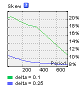
Skew (Risk Reversal) for a set of standard terms.
Calculated as a difference between Put and Call IV for
Given data values of 25% and 10%
This measures the excess implied volatility, if any for in-the-money (ITM) call and put options using average implied volatilities for options with deltas near .75, in the case of 25% curve and .90 for the 10% curve. Both examples are ITM options unlike the traditional volatility smile comparing ITM implied volatility to out-of-the-money (OTM) implied volatility.
The skew curves display the extent to which the two sets of in-the-money options are priced with respect to time to expiration. This is useful for those interested in selecting options for long- term strategies using in-the-money options.
In addition, we display a Butterfly chart.
The???explanation says:
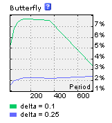
Butterfly for a set of standard terms. Calculated as an excess of Put and Call IV for a given delta over doubled ATM IV for delta values of 25% and 10%
Here we are using multiple options to compute two approximated hypothetical call butterfly spread curves. Once again, we are using options with delta values of 25% and 10%, meaning that for the 25% curve options we use options with delta values near .75 and .25, while options with delta values near .90 and .10 are used for the 10% curve.?
Due to the differences in implied volatility between in-the-money (ITM) options and out- of- the-money (OTM) options, referred to as volatility smile, ITM options are more expensive in implied volatility terms and the further ITM the more expensive.
Since a hypothetical butterfly spread using a long call with a .90 delta will be further ITM, it will have higher implied volatility than a butterfly with a long call using a .75 delta option. In addition, there should be more excess implied volatility in the spread and this is what is shown on the small graph, as the 10% curve shown in green is higher than the 25% blue curve.
These are hypothetical curves and do not represent actual trades since deep ITM options may not be actively traded and the bid/offer spreads may be very wide due to a lack of trading. However, for the higher priced stocks with many active option series actual trades may be practical.
Further, butterfly spreads require lower maintenance margins and since the maximum valuation occurs when the underlying is exactly at the price of the two short middle options this strategy may be useful for a specific price objective. However, since they have an upper and lower breakeven price the 10% hypothetical trade will have both a wider profit range and a higher potential maximum. The potential differences are reflected in the relationship between the green and blue curves shown above.
CBOE S&P 500 Skew Index?(SKEW) measures the purchase of out-of-the-money S&P 500 Index puts that require a very large downside move to profit from long put positions. An increase of this index indicates greater expectations for an extreme down move. Started in January 2011 the CBOE claims it measures the perceived risk of an extreme negative move “tail risk” or a “black swan event.” The SKEW is said to be focused upon the market anticipating a 2 or 3 standard deviation down move where 100 means the perceived distribution of S&P 500 Index log-returns is normal so the probability of outlier returns is negligible. Above 100, the left tail of the S&P 500 Index distribution acquires more weight as the probabilities of outlier returns become more significant. More information on the?CBOE S&P 500 Skew Index?is available on their website.
Now turning our attention to the lesser followed statistical skew based upon the daily price movement of the S&P 500 Index not options.
The two relevant terms are?Skew, the degree of asymmetry of the distribution around its mean and?Kurtosis?the relative peakedness or flatness of the distribution compared to the lognormal distribution often used to describe the extent of the difference between an actual frequency distribution a lognormal distribution. The links above explain each in detail along with the formulas used for their computation.
Skew and Kurtosis data is available to subscribers of our?Advanced Historical Data?service (we offer a free two-week trial) see the fourth tab at the top right: Skew & Kurtosis.
In the first section, there are 8 chart selections for various applicable measures using seven periods from 1 month to “all data” from the drop down box. Next select the chart term from 30D (30 days) all the way out to 180D. The final chart selection determines if chart including IVIndex where IV is implied volatility, compared to Skew and Kurtosis uses the Mean, Call, Put or both the Call and Put values.
Next, just above the two default charts are two data tables displaying Skew and Kurtosis values calculated for eight periods and include six more columns of relevant data for each, such as the low the and high values along with the dates.
The significance of the data is the relationship to a lognormal frequency distribution of price changes used in options pricing models, such as the Black and Sholes assuming price changes are log normally distributed with a slight positive skew. For reference the commonly pictured ?bell-shaped? distribution is a normal symmetric distribution with a zero skew, meaning up-and-down price changes have the same probability.
Used in conjunction with current option implied volatility, skewness suggests how inexpensive or expensive options are considering an options model using a lognormal distribution assumption determines implied volatility. If the current price changes are not log normally distributed then option prices may not reflect their current true value.
A positive skew implies a large probability of a small loss offset by a small probability of a large gain. Negative skew suggests a small probability of a large loss offset by a large probability of a small gain.
Kurtosis is a measure of the degree of peak in a distribution. A tall narrow distribution has positive kurtosis caused by an increased number of very small and very large price changes with a decreased number of intermediate price change. Most markets have positive kurtosis with a large number of price changes smaller than one standard deviation along with a large number of three standard deviation price changes. A low flat distribution has negative kurtosis with few small price changes and many intermediate price changes.
The skew and kurtosis charts included in Advanced Historical Data are helpful to visualize the distributions.
For example, here they are for the six months ending June 30, 2014.
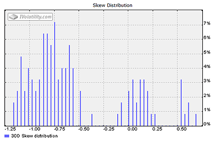
Skew 30 Day Term -.5436
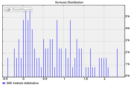
Kurtosis 30 Day Term .2591
Now here is a chart showing how both changed over the last year along with the SPX price chart.
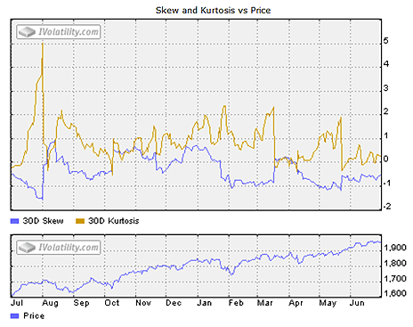
Skew 52-week low -1.5736 August 1, 2013, high .9337 August 13, 2013
Kurtosis 52-week low -.5196 October 9, 2013, high 5.02898 August 1, 2013
In the skew chart above although the bulk of the data appears to be on the left with a long right tail suggesting the distribution is positive or skewed right the computed data indicates it is slightly negative as it has usually been for most of the last year shown as the blue line in the Skew and Kurtosis chart above shows.
For investors negatively skewed distributions can mean frequent small gains and a few large losses, while a positive skew suggests frequent small negative price changes and a few large gains. Extracted from the data table and shown under the Skew and Kurtosis vs. Price chart, the 52-week skew low occurred on August 1, 2013 just before the S&P500 Index began a decline lasting almost a month. However, no comparable reading foretold January 2014 decline when the skew was about .7500 positive.
As for Kurtosis, higher values indicate a higher sharper peak with more of the variability due to few extreme differences rather than many small differences in the price change from the mean. The chart and data from the table shows the 52-week high was also on August 1, 2013 at the same time the skew made a 52-week low. However, in January 2014, kurtosis was moderately elevated at around 1.500 and like skew, providing little warning of the impending decline.
However, using these measures as a way to forecast price direction is probably incorrect. A better interpretation is to focus on the extreme values and look for change in the Historical Volatility also called Realized Volatility of the S&P 500 Index. As with all return to the mean phenomenon like investor sentiment, 52- week low and high extremes when used with the VIX could offer some additional timing insight for those looking to fade the market direction and/or implied volatility since VIX will advance in anticipation of increasing Historical Volatility.
Summary
The term skew often appears in the options world and may be confusing since it has more than one meaning. Most refer to the relative pricing relationship between calls and puts that may offer trading opportunities. In contrast, skew along with its companion measure kurtosis refers to the actual price change distribution of the S&P 500 Index without considering option pricing and may be useful in conjunction with VIX to anticipate changing volatility.